Following our lavishly-positive opinions of the Moto G (3rd Generation) and Moto X Play, the Moto X Pure/Style (Pure in the US, Style most of elsewhere) has a lot to live up to. While the Moto G3 did admittedly deliver fantastic value-for-money, its status as a budget device means it’s difficult to make a direct comparison with the flagship Style.
The Moto X Play, however, presents difficulties. It’s a mid-range device that’s about as close to top-tier as you can get, without throwing another 30% more money at the camera and some minor hardware improvements. Is it even possible for the X Style to look appealing with its larger price-tag in the face of this kind of competition from its own sibling?
Turns out it is.
Design
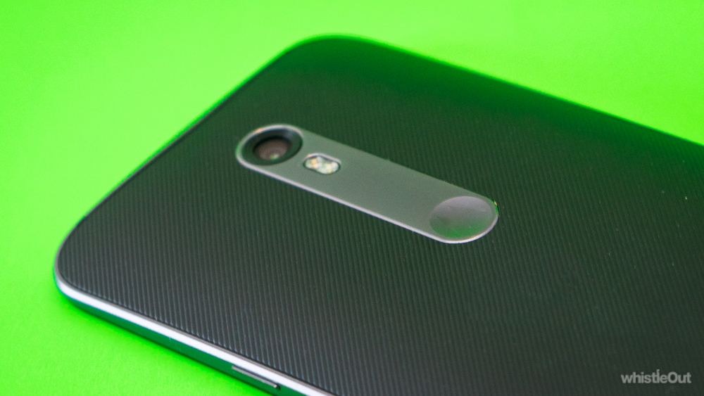
None of the Moto devices released in 2015 are particularly attractive in their off-the-shelf state, but at least they get a little better-looking as you go up the ranks. At the very least, the X Style isn’t eye-catchingly drab, like the Moto X Play, and lacks the thoroughly-forgettable quality of the G3’s design aesthetic.
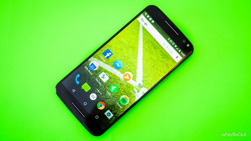
Though not a head-turner, the Style’s design has functionality and solid build quality written all over it. The rubberized back means better grip and no smudgy fingerprints, and sports Moto’s now-familiar little center dimple; a surprisingly-comfortable resting place for the index finger on either hand.
The side-mounted volume and lock buttons are both easily reachable with any hand, albeit more-so with the right, and they’re situated within a solid metal rim that encircles the whole device. This final touch adds a level of ‘premium-ness’ that many plastic phones lack.

It’s a big phone. The 5.7 inch display puts it in the same category as the Samsung Galaxy Note 5 or iPhone 6s Plus (the 6s Plus has a smaller 5.5 inch screen, but is larger in two out of three dimensions to the Style). Thankfully, Moto has paired the larger screen size with an increased quad-HD resolution (1440x2560), also matching the Note 5 and many other flagship Androids.
While QHD isn’t overly necessary on a smaller phone, it matters more as you increase screen size. In a perfect world it’d be more of a marketing thing than a make-or-break feature, but in this one a flagship device has to have the best resolution it can.
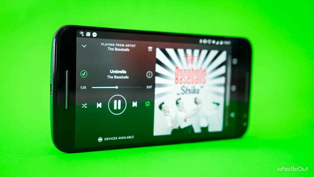
The dual-speakers are located on the front at the top and bottom. This is a fantastic feature that more phones should have. Front-facing speakers mean that you can put your phone down on a table, control the playback using the screen, and still listen to whatever you want without the sound being muffled.
These speakers can’t compare to the craziness that is HTC’s BoomSound tech – which seem a definite inspiration here – but at the very least they’re a significant step above average.
Screen
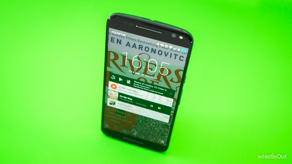
That 5.7 inch quad-HD display puts out a cool 520 pixels per inch (ppi). That’s the same as a Galaxy Note 5, but creams the 403ppi of the mid-range Moto X Play, and top-tier 401ppi of an iPhone 6s Plus, and 326ppi of an iPhone 6s.
Can you really tell the difference? To a point, yes. If you have pretty good vision, you can definitely spot the change when you drop back from using a QHD display to a ‘mere’ 1080p. It’s more-apparent with bigger 5.7 inch screens than it is with something like the 5.2 inch Galaxy S6, but even so the jump isn’t startling.
All in all, the Moto X Style has a great display. It’s as crisp as you could reasonably ask for, has great color vibrancy, and handles contrast well.
User experience
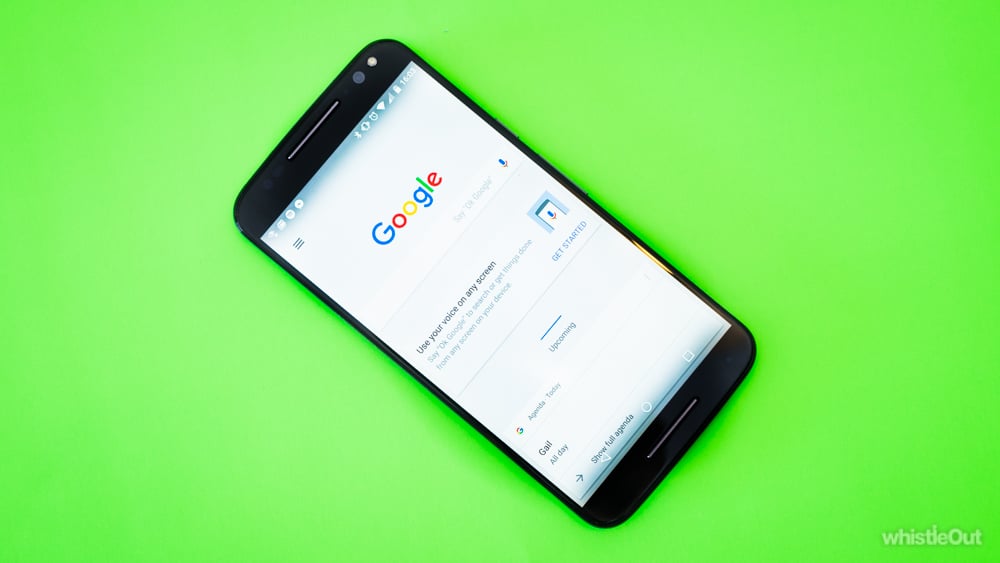
Using the Moto X was a fast, fluid, and annoyance-free experience. This really is a phone with no real day-to-day downsides.
That should come as no surprise; the 3GB of RAM and Snapdragon 808 processor put it up with some of the most-powerful devices on the market. Before you point out that there are stronger ones, be reassured that what a phone looks like on paper means nothing compared to real-world performance.
The truth of it is, most smartphones run heavy third-party user interfaces (UIs), slapped on top of the Android operating system (OS). These UIs, often weighed down further by un-deletable bloatware, strain the system power and memory. Subsequently, you get less out of the hardware you have.
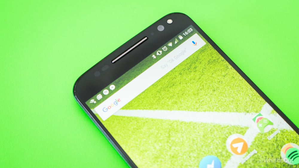
Not so with Moto; there’s no third party UI here. Motorola uses what is affectionately referred to as “vanilla” Android, which is the default experience as Google intended it to be. It’s faster, more-efficient, and these days even a lot prettier than most other modern UIs. On top of that, Moto phones also receive Android updates far faster than other phones, meaning you’ll always be up-to-date with the best OS Google has to offer.
Battery life is a strong point for the Moto X Style. It’s not outrageous, like the 2 days we often got from the iPhone 6 Plus back in 2014, but it’s a fair day to day-and-a-half. You’ll still need to charge it every night, but pushing it with anything short of notorious battery hog games like Hearthstone didn’t send us searching for a power point before day’s end. More than once I personally even clocked up a good 2 hour skype call at the end of the day, then hit the sack around midnight with over 15% to spare.
Motions and gestures

Moto hasn’t let Google do all the work; there are a few small software touches.
The Moto lock screen already made its debut in previous models, but it’s back and as great as ever on the Style. There’s the stock-standard lock screen, which shows notifications and lets you jump either straight to the camera or dialler. That’s all well and good, but it’s nothing to do with Moto.
Underneath that is where it really gets interesting. When in rest mode, the Moto X Style is still passively scanning for gesture and tap triggers, but in a low-power state. All you have to do is wave your hand across the screen and it will briefly light up, with a custom display showing you the time, as well as whether or not you have any notifications, and what apps those notifications are from.
This display mode also triggers when you pick up the phone. Tapping one of the notification icons and dragging upwards will automatically unlock the phone (skipping the regular Android lock screen) and take you straight to the app in question. Sliding down will perform a regular unlock.

It sounds like a small thing, but little bits of easy functionality like this are the difference between a good phone and a great one. It’s far less invasive during a conversation to wave your hand across your phone, rather than actively tap on the screen, which means you can check your notifications without looking too bored. It’s also much faster than the double-tap-to-wake system on a lot of other phones. The low-energy display means it can show you what you want to know immediately, rather than taking a second or two to power up the screen and load notifications.
The second two custom features we couldn’t stop using were both motion commands, based on shaking the phone in a couple of ways. Historically, this kind of thing has been annoying in phones, as they have a habit of registering randomly when in your pocket, but that didn’t happen to us with the X Style.
You can wake the camera by twisting the Style rapidly back and forth along its length, as if you were making a vigorous “so-so” motion in response to a question. Once you get the hang of it, you can do it as you’re raising the phone to shooting position, meaning the camera is almost fully powered up by the time you’re ready to take a shot.
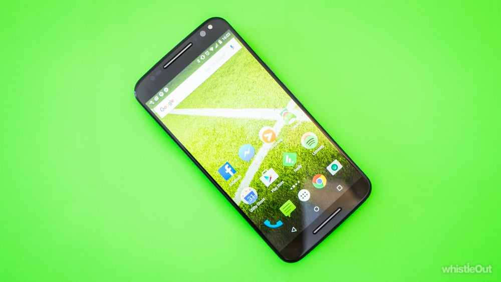
The second is the flashlight. Make two quick chopping motions, as if you were hacking at something with the thin edge of your phone, and the flashlight pops on. Two more and it turns off. This is crazy useful if you’re a restless sleeper like me, or any other time you find yourself in the dark. Removing the small time it normally takes to wake the phone, find the flashlight command and turn it on, actually translates to using the flashlight more-often in the real world.
These three features may seem like little ones, but they turned out to be some of the better experiences we’ve had with a smartphone in a long time. Now that all handsets are essentially super computers that you keep in your pocket, the new challenge for manufacturers is making things easier, rather than more-powerful. Moto has done this subtly, and without weighing down its UI with needless bloatware.
Camera
Make or break time; the Moto X Style has been able to keep up with the top-tier pack in terms of performance, but how is its photo game? Better than Moto has historically done, but not quite up to par with the likes of Samsung, LG, or Apple.
The main problem with the Style’s camera is the easiest thing to get right: the user interface. For reasons unknown, Moto has regressed to a tap-anywhere-to-shoot system; as opposed to the modern standard of tap-to-focus. In theory, this would be fine if camera autofocus was perfect 100% of the time, but so far that’s been beyond the ability of any phone and the Style is no different.

Consequently, you end up standing there wobbling your camera back and forth to force it to re-focus, in the chance that it will finally pick up on the object you want. Often, you have to frame your picture differently to how you'd planned, because your desired focal point isn’t registering with the way you’ve sized up the pic. This is annoying, pointless, and is a mistake that shouldn’t be being made anymore.
It’s even more frustrating considering the quality of some of the pics the Moto X Style is capable of churning out; quality that is sometimes denied to you if you aren’t framing your shots the way Motorola expected.
Most of the time, the autofocus is good enough to handle what you’re asking of it. In those occasions, the camera turns out pretty good photos. They can be a little dull in terms of color, like this one below that was taken on a fairly sunny day, but there’s still a huge amount of detail.
In lower light things are a bit variable. Check out this rad Stormtrooper wall art, taken indoors in lighting that would have been a serious obstacle to any phone back in 2014, even iPhones and the GS5.
Take the ambient brightness a teeny bit lower, and immediately the image suffers. If you’re one for taking shots in bars, make sure it’s not an overly-dim one.

Shots taken totally at night aren’t anything to write home about. You can capture what’s going on well enough, but when held up against the LG G4, Galaxy S6 or Note 5, or anything Apple has released in the last 2 years, it can't compare.
All in all, the Moto X Style’s camera is great when you consider that this phone is a lot cheaper than most of the other flagships out there, but it can’t keep up with the leaders on a shot-for-shot basis in low-light conditions. More-importantly, the UI needs a serious overhaul to allow for easier manual focus.
Verdict
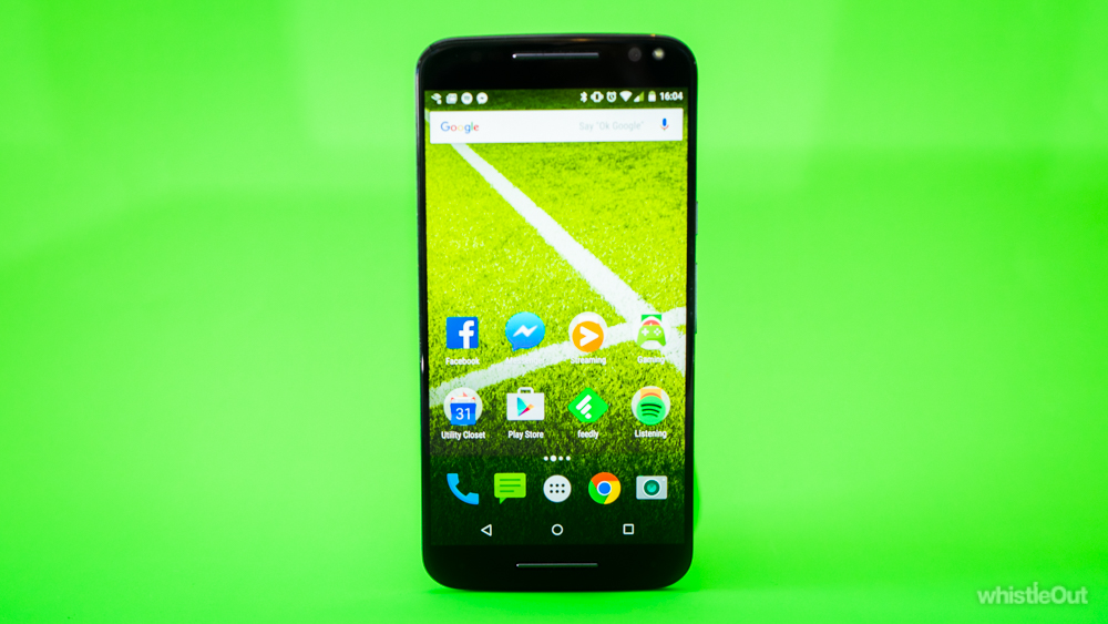
This Moto X is an utterly fantastic top-tier phone, with an almost-great camera experience. Remembering that it’s a fair bit more-affordable than the other flagship devices out there, this is a forgivable trespass, but most of the problems could be fixed with a little bit more attention to good camera app UI design.
If you’re ok with having a great phone for a good price, with the downside of a “merely pretty-good” camera, then you seriously can’t go past the Moto X – with the possible exceptions of the Nexus 5X and Nexus 6P.
If you’re absolutely after having the best shooter on the market, the Samsung Galaxy Note 5 is the same size, and delivers a similar user experience, but with a significantly better camera (and a much-higher price tag).
Related Articles
Related Topics
Motorola Moto X Pure Moto X StylePopular Topics
Android Apple iPhone Samsung Google iOS Cell phone plans Rogers Telus BellFind Better Phones and Plans
Hundreds of cell phone plans unpacked. All the facts. No surprises.


