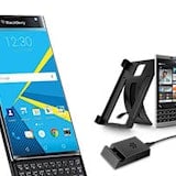
 The BlackBerry Z10 has been hailed as BlackBerry’s last best hope for survival in the smartphone market. It’s the new BB10 OS’ flagship, sports a totally modern set of hardware specs and is a step in a different direction for BB in terms of stylistic design.
Many people have said that it’s too little too late from the folks at BlackBerry, others have said that it should be enough to keep things going until further improvements can be made. Never keen on relying upon what others think, we grabbed a hold of one ourselves to review.
We’ve only had it for a couple of hours so far, so the full review is at least a week away, but in the mean time we thought it wise to give our first impressions.
Z10 Physical Design
At first glance the BlackBerry Z10 looks pretty much like an iPhone. It’s a slab of black smartphone with straight edges and rounded corners. It’s sleek, stylish and, from the front, fairly lacking in originality. Once you pick it up, however, there’s this sort of “ooooh” moment and the impression immediately changes to that of class as you suddenly realise the logic behind the design choices.
What creates this feeling of classiness is the mottled rubberized rear plate. It sounds silly, but the Z10 really does feel like and almost luxury device when you’re holding it. It’s a totally no-nonsense look and feel, but without sacrificing comfort or aesthetics. Basically, it feels like an iPhone that’s here for business, but will do other stuff too if you want.
The power/lock button is located in the middle of the top of the device, which is an interesting choice. We assume it’s avoid being biased in favor of the right-handed majority, as it certainly doesn’t make it easier for righties to press, but it doesn’t seem to make it much better for lefties either so perhaps it’s just down to style.
The right-side volume rocker is also interesting, as nestled between the up and down volume buttons is the voice command activation key. So far we’ve accidentally activated the voice interface while attempting to adjust volume, but this feels like the kind of thing that we’ll get used in short order.
Probably our biggest gripe is with the left-side oriented Micro USB port. Anyone who hasn’t used a side ported phone will think this sounds like an overreaction, but it can really get in the way. Bottom or top, preferably bottom, is the only way to go in our experience. It’s not going to be the kind of issue that lowers the end score of the device once we do the review, as it’s more of a pet peeve, but it’s still somewhat of minor annoyance.
Conversely, we have no problems with the Micro HDMI port being located in the same position, as one tends to not use their phone too much while it’s got an HDMI cable running out of it.
Display and BB10 UI
The HD 768x1200 4.2 inch display is great. We’re yet to view any HD movies on it, but it’s colourful, crisp and very smooth. Pinch to zoom works a treat on images, emails and in the browser and moving through the interesting new UI is also super quick.
As for the UI itself it’s a mixed-bag. The real issue with it is that it’s very unintuitive. We knew this going in and it’s something that BlackBerry itself seems to have recognized, but after looking up a simple 5 minute demo video on the web we were ready to go.
The swipe-only system (no Home, Back or Search buttons either hardware or capacitive to speak of) feels like the kind of thing that will be fast and great once we get used to it, but is a bit frustrating at first. Instead of a Home button, the user swipes from the bottom of the screen upwards and releases. This is easy enough to get used to, but we’re barely even inside the rabbit hole just yet.
Swiping up and holding is called “The Peek”. This allows you to view any notifications. Should you wish to view said notifications you can then, without releasing your finger, swipe to the left. This takes you to the BlackBerry Hub, where all of your messages, emails, social media alerts etc are bundled in to one list.
At first the Hub was a bit confronting to us, as we get a lot of emails and the default setting is to treat each email as its own alert, rather than threading them in to conversations. But heading in to BlackBerry Hub Settings > Display and Actions > Display and switching the mode to “Conversation” makes things much better, as emails from the same people with the same subject only take up one row on the screen.
We’re not usually down for amalgamated hubs; we like to keep our messages and services separate. But BlackBerry Hub works pretty well and we like how easily accessible it is from any point in the UI.
The “Home Screen” that is accessed BY BlackBerry’s, you, it, nestled, it’s, one, we, its, emails, it, itBY BlackBerry’s, you, it, nestled, it’s, one, we, its, emails, it, itby the aforementioned upwards-swipe is actually a multitasking screen. This screen shows four open apps at once and can be scrolled vertically to reveal more. It’s pretty handy, as it allows you to more quickly move between apps that you’re currently using, rather than navigating through home screens. The windows that represent each app are also updated in real time, so, should you have FB open, you’ll actually see your updated FB news feed, in theory. So far this has worked pretty well, but we haven’t had too much time with it yet.
Swiping to the right from the Multi-Tasking, or “Home”, screen takes the user to a very familiar layout. If one weren’t looking too closely one would swear they were staring straight at iOS. We think that BB could have been a bit more original here, especially considering the increasing feeling in the tech industry that iOS’ look and feel is becoming a bit stale.
Not only that, but the icons feel a bit out-dated, like something from two or three years ago. They’re not ugly; just not pretty, either. Also, moving them around is a bit of a hassle, although iOS users won’t notice any difference as it seems to be exactly the same system.
BB10 Apps
From what we can see app availability is still extremely limited. A lot of favorites like Facebook, Twitter and LinkedIn all come pre-loaded, but other market staples like Evernote can’t even be found on the BlackBerry World PlayStore.
Of course, BB10 made a few headlines when users discovered that you could side-load Android apps, so we’ll give this a go during our review phase and see how that goes.
Maps
Maps seem pretty average; not good, not great. The default Maps app is certainly no Google Maps, but at least it seems better than Apple Maps in our short test of it. There does seem to be a distinct lack of walking directions, with the only option being travel by car. This is definitely something that we’ll look further in to.
The Z10's Camera
The camera, in our very limited tests so far, is a bit underwhelming. We’re yet to play around with any special features, but the images themselves seem a bit washed-out and fuzzy.
There’s at least solid email and app integration with the camera, so at least there’s that.
Overall
So far the BlackBerry Z10 seems like it could be a pretty good phone. The UI is a bit too unintuitive for us to get any solid feelings for how our experiences with it will go one way or the other, but it’s at least a fast, smooth and capable device.
At the very least we have a good feeling about the swipe gesture-based interface and, aesthetically speaking, the Z10 is a win for its classy design, if not for its uninspired icons.
The camera has so far failed to impress, but it’s raining at the moment so we’re kind of stuck in doors.
At the very least, the Z10 and BB10 so far represent a huge leap in modernity and ability from BlackBerry’s older phones. It really feels truly modern and, for a first-generation OS, BB10 is incredibly impressive. But the public won’t be impressed simply because it’s new; it’ll have to be able to go toe to toe with the likes of iOS, Android and Windows Phone if it’s to succeed.
We think it has the potential, so we’ll see how it goes in the coming week.
Related Articles
Related Topics
BlackBerry BB10 BlackBerry Z10Popular Topics
Android Apple iPhone Samsung Google iOS Cell phone plans Rogers Telus BellFind Better Phones and Plans
Hundreds of cell phone plans unpacked. All the facts. No surprises.


