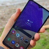
It’s unlikely that Samsung, or anyone else, expects curved-edge screens like this one to become a new norm. Like the Samsung Galaxy Round and LG G Flex, the Galaxy Note Edge is an east way for its maker to recoup some of its R&D costs as it marches towards flexible OLED panel technology. The end goal: screens that don’t shatter or crack on impact.
For now, we’re left with a very expensive, incredibly-niche device. It’s admittedly intriguing. It’s not often that a different kind of phone comes along and it’s exciting for reviewers when it does.
Sadly, more often than not they're usually unique for a reason and the lustre quickly fades. In this case, the magic is gone within a day or two. The Note Edge is in some ways a great phone, but none of that is to do with its biggest draw and flaw – that fancy edge display.
Design

The Edge is an attractive curiosity to behold. It's new, smooth and sleekly built, but once you pick it up its flaws are many.
The right-hand edge display is all but impossible to use in the left hand, leaving about 10% of the population using their off-hand to keep secure one of the most expensive phones on the market.
Even righties will have trouble with grip. On its sibling, the Note 4, the power/lock button is located on the right-hand side. This is because it’s a huge phone and reaching all the way to the top one-handed requires some deft hand gymnastics if you’re going to keep your grip.

On the Note Edge, the right-hand side has been removed for the screen. The obvious solution would be to place the lock button on the left, below the volume keys. Instead, it's up the top. This means you end up juggling your phone around in your hand every time you want to lock it. Given how pricey this phone is, the last thing you want is to be fumbling about with an insecure grip.

Actual build quality is nice and feels firm. Samsung has employed a metal rim running around the sides, much like the one on the Note 4. You also have the same soft-touch, textured rear plate which adds a bit to grip, but could probably do with an aesthetic makeover.
The camera housing sticks out a couple of mm. This means that the Edge can never really sit flat on a table. On the up side, said housing is flat, so it doesn’t rock about like an iPhone 6 or 6 Plus.

Of course, there’s the call-sign S-Pen hidden away at the bottom. Unintuitively, this turned out to be one of Samsung’s better stabs in the dark. Having a stylus on a big phone really does add a level of usability. It’s not for everyone, but it shouldn't be dismissed without at least giving it a go.
Screen and UI

Specs first. The display on the Note Edge is a 5.6 inch, 2560 x 1440 display that gives you around 75% more pixels than the 5.5 inch iPhone 6 Plus. It’s crisp, beautiful, vibrant, and delivers some of the blackest blacks on the market. It doesn’t do white amazingly (it’s a little on the yellow side), but you wouldn’t notice unless you held it next to something like the HTC One (M8).
As for the curve, it’s eye-catching and interesting, but it gets in the way. Samsung’s Touchwiz user interface (UI) has struggled against critics every time an update is made, but this time around the changes really do seem like an attempt to justify the form factor, rather than innovative thinking.

The main difference is that the task bar, usually located at the bottom of the screen, has been relocated to the side. At first this sounds like a decent idea. You can add and remove apps at will and even add enough that you can scroll up and down through them. This opens up a whole extra row down the bottom of your phone and lets you cram in tonnes of reduced-size icons in to the side column.
Now the problems fly in hard and fast. You can only add one more app than fits on the screen. This is a pointless limitation. Either add the ability to scroll to accommodate more icons, or don’t let people do it at all. Having one extra icon is no more useful, but it is enough to make you frustrated that you can’t add more. It’s like being shown a bottle of good wine, open and ready to go, but only being poured half a glass and being forced to watch the rest spoil.

Notifications have also been moved to the side; another misstep. Consider: this is also your task bar. A dozen times or more a day we went to hit an icon, only for a notification to pop up and launch a totally different app.
Perhaps the only useful addition thanks to the new edge screen is audio playback. Swiping it either left or right will bring up the controls for whatever you’re listening to, no matter the app.

This is an easy way to control your music or podcasts without having to root through menu screens, pull down the hard-to-reach notification tray, or use the multitasker. Is it good enough to justify the curve? No, but at least it’s something.
Camera
The camera is absolutely great, except for one thing: once again the edge screen pops in to make its unwanted presence felt by relegating the camera controls to its parabolic domain.
he buttons move around depending on whether you’re in portrait or landscape. This would be fine, except that there’s sometimes considerable lag, enough that you can take one photo with the button in one location, then have it jump to the next as you try to take a second.
Controls aside, image quality is spectacular. It’s not quite up to iPhone 6 Plus standards, but it’s closer than anything else on the market. Except, of course, the Note 4, which has the same camera as the Edge.
Video also comes out really well, especially in 4K mode – something the iPhone 6 Plus can’t do. Before you get up in arms about how pixels don’t necessarily mean better image quality let us assure you that the Samsung series phones really do handle video better than iPhones when you switch them to 4K mode. Of course, be prepared for massive video files, but the 32GB of onboard storage should generally be enough to handle it.
Connectivity and battery life

These are the two areas of the Note Edge that are sub-par without the meddling of the curved edge to help bring them down.
At least once a day we needed to reset the Note Edge to regain cellular connectivity. Even when it worked we found we often got 3G in areas where 4G is prevalent on other devices.
WiFi works fine and supports the 802.11 a/b/g/n/ac standards.

Despite rocking a huge 3000mAh battery, the Note Edge barely lasts a day between charges. Push it even slightly and you’ll be looking for a power point by 8pm or so. It charges quickly (about 2% per minute) if you use the Samsung quick-charge wall charger, but using a normal charger will take a while.
The lack of longevity is surprising. The Note 4 made a whole day comfortably when we reviewed it and has a slightly larger screen. Just another reason to go with the Edge’s more-traditional cousin, rather than be tempted by its own new and exotic ways.
Verdict

Everything that is good about the Note Edge – camera, power, screen quality – are all found in the Galaxy Note 4. Everything that is bad – the gimmicky screen, poor connectivity and mediocre battery life – are not.
The Note 4 also has the advantage of being cheaper; not something that it can usually brag about thanks to its own considerable price tag.
If you’re after a big-screened Android, go for the Galaxy Note 4. The Note Edge is an expensive curiosity that wears thin very quickly. Sorry, Samsung. You make some great devices, but this isn't one of them.
Related Articles
Find Better Phones and Plans
Hundreds of cell phone plans unpacked. All the facts. No surprises.


