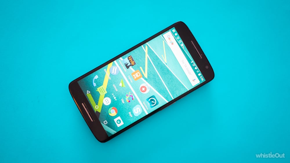
The Moto-X Play is a sort-of sub-flagship from Motorola. Coming in just behind the Moto-X Style (AKA Moto-X Pure, depending on your location) in price, the Play holds true to Moto’s recent shift towards affordable devices that skip the gimmicks and focus on the core user experience you really need.
The result is a great phone that operates quickly and fluidly, but won’t break the bank.
Setup
I don’t usually wax lyrical about setting up a new phone, but this time it was different. Switching to a new Android phone is generally a serious task. Despite Google’s best efforts, more than half of your apps are never automatically transferred; you end up spending at least an hour installing, signing in to and then editing the notification settings of new applications.
I have never, ever, had a flawless Android setup. Until now.
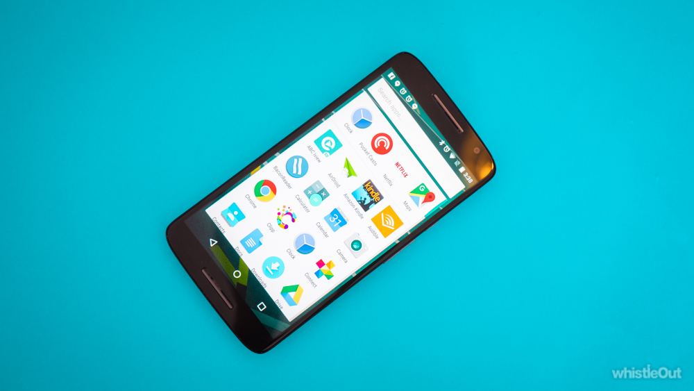
Thanks to the Motorola Migrate app, which can be installed on your old phone no matter the manufacturer, you can switch from one Android to a new Motorola phone with ease. It not only downloads all of your apps, but arranges them in the same home screen setup you had before. I didn’t even have to adjust any notification settings. It just all… worked.
Unfortunately, while you can download the app on to any phone, it only works when you are switching to a Motorola device. Still, you can rest assured that this will be the easiest Android setup you, or anyone else, has ever had.
Design

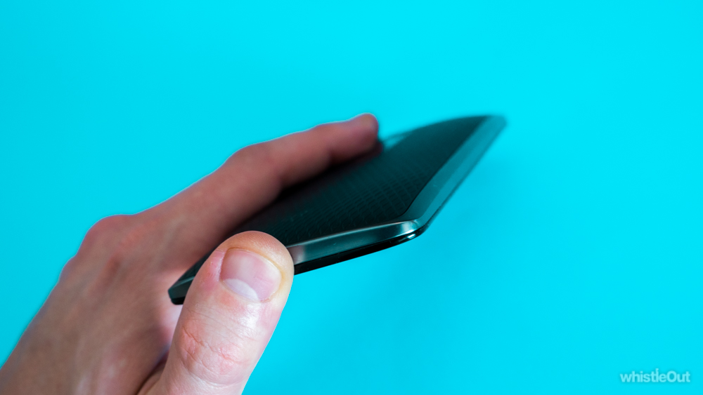
There are two things that you immediately notice about the X Play when you pick it up. The first is how incredibly well-built it is. It feels solid, is easy to grip, and the metal rim gives it a premium feel.
Feel; not appearance. The second noticeable quality is how very drab it looks. Viewing it from the rear, it appears to have taken more after Motorola’s old design aesthetic than its new one. If a smartphone can look old-fashioned, this one definitely does.
From the front it’s just like any other smartphone; it’s a black, rounded rectangle with a screen in the middle. The bezels are all quite thin, leading to a smaller physical footprint, and the side buttons are solidly constructed.
Overall it’s well-built, feels great, but isn’t going to turn any heads when you plonk it down on a café table.
User experience
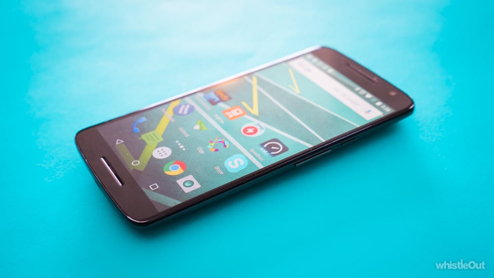
It’s easy to forget that this is not a top-dollar phone. Sure, you can point out the ‘only’ 1080p display (which still affords it 401ppi; the same pixel density as an iPhone 6s Plus), or the weaker hardware specs. None of that really matters. The proof, as they say, is in the pudding. The Moto X Play manages to handle day-to-day use with the natural ease of a far more-powerful handset. The pudding is delicious.
It’s smooth as butter when it comes to general operations. Switching between apps is fast, as is unlocking the phone, or launching just about anything. You’d probably get a bit better response time out of some of the flagships, but even the world-class Galaxy S6 would have trouble keeping up with how the Moto X Play handles standard tasks.
Of course, a phone this price isn’t going to be able to compete in every aspect. Once you start hitting up the more hardcore apps like Hearthstone, there’s a little graphical and processor lag. That’s about as far as the average user might possibly push a smartphone, and the X Play still handled it fantastically for a mid-range phone.
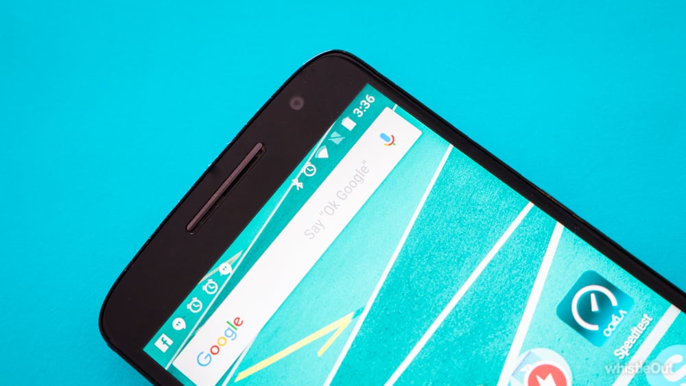
The screen is crisp and bright. You won’t notice the dearth of pixels unless you’ve the keen eye of a hawk and have become accustomed to a 1440p display. Even then it’s a toss-up between that negligible image improvement and the extra battery life you get from 1080p.
Battery life is great. We regularly got 1.5 days out of the X Play. That still means you’ll probably be charging it every night, but you’ll likely never find yourself keeping a stressful eye on that battery bar on your way home of an evening.
Camera
Photos are another area where the Moto X Play reminds you that it’s not a top-price device. This is nothing to be ashamed of. The camera is still quite good, even very good for a phone this price; it’s just that any kind of imperfection almost comes as a surprise whenever they surface, as the rest of the user experience tends to let the fact that this is a mid-ranger slip your mind.
Photos taken during the day come out pretty well. Occasionally colours are a little flat, even dark, but on a good day with decent light you can grab some great detail.
Even shots that capture a lot of light and dark areas don’t suffer too much. This shot of a pyramid-shaped memorial would feature either massive glare, or impossibly dark shadows on a flagship just a couple of years ago. Here it has been captured perfectly, but I guess that's modern-day auto-HDR for you.
Indoor photos are a little variable. Sometimes they come out grainy, especially if there’s movement. Others you can get a genuinely nice little shot, like this one of our office.
Shots taken in low light are predictably disappointing. This is the one area where you can always be sure that a full-price smartphone will beat out anything underneath it. It’s the holy grail of handset photography, and it’s no surprise that the Moto X Play doesn’t handle itself too well in dark or situations.
Verdict

Considering that the Moto X Play can be anywhere from about two-thirds to one-half the price of and iPhone 6s, there’s not much more bang-for-buck out there on the market right now, with the possible exception of the budget Moto G3.
If you’re after a mid-range handset, there’s no better that we’ve used. The only contender we can think of would be the very soon-to-be-released Nexus 5X by LG, which has a very similar price tag. Once the 5X is out it’ll be easier to compare the two, but for right now, if you’re after a mid-ranger, go out and grab yourself a Moto X Play.
Related Articles
Find Better Phones and Plans
Hundreds of cell phone plans unpacked. All the facts. No surprises.

