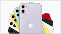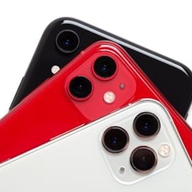
Apple product announcements are traditionally met with a mixture of fanfare and cynicism, but after the recent iPhone 5c unveiling, many were experiencing a tiny bit more of the latter than in previous years.
It was expected that a more economical version of Apple's flagship device would be released this year, and the California company proved the rumours correct. But Apple's use of pretty colors seemed to be a distraction from the fact that, on paper, the iPhone 5c is more or less and iPhone 5 with a few slight tweaks that most users won't even notice.
So when we finally got our hands on the 5c, we were intrigued to see if the 'cheap' iPhone would offer any surprises.
Design

We trialled the 5c in white, and design-wise, it’s basically the same as the iPhone 5 – except, of course, for the plastic finish. It doesn’t look as cheap and nasty as photos may have you believe, but still isn't quite as eye-pleasing as the 5s. In keeping with Apple’s style of being consistently consistent in their smartphone releases, all the outside features – headphone jack, volume controls, power button, etc. – are in the same place as the last iPhone.
The phone itself feels quite light and sleek in the hand, but although it’s not as slippery as an unprotected aluminium-cased iPhone, you’ll still probably want to invest in a case to help keep your grip on your new device. Fortunately Apple had supplied one of its specially-made 5c cases in light blue.
It’s a well-made phone cover, and of far better quality than the dodgy silicone cases you’ll find at your nearest dollar store, but the holes on the back are a strange design decision. We assume that they serve an ergonomic purpose, but the fact is, they look kind of ugly, especially as you can see bits of the iPhone label and assembly details that are printed on the back of the phone itself through the holes.
Display

To put it bluntly: if you’ve seen an iPhone 5 display, you’ve seen an iPhone 5c display. It’s another area where Apple have gone with the ‘ain’t-broke-don’t-fix-it’ philosophy, but the 5’s 4-inch retina display is of good enough quality to not demand an update.
Overall, anyone used to Apple devices will have no complaints about the 5c’s display, although users more accustomed to bigger screens or a higher pixel density might feel the phone is a downgrade.
iOS 7

Look, Apple – we understand. You’ve kept your operating system visually the same for a while now, and maybe you’re feeling the pressure to be innovative (or at least appear innovative). So, much in the way you’ve appeared to have slapped a coat of paint on the iPhone 5 and called it the 5c, you decided that giving iOS a makeover would keep everybody happy.
In theory, this might have worked, if the redesigned iOS 7 wasn’t so dull to look at. What was once a colorful and aesthetically pleasing interface is now, for lack of a better word, ‘meh’. And while user experience is far more important than prettiness, it’s not a good sign that our first impression of iOS 7 was an underwhelming one.
Some aspects of iOS have improved with the update. We like the new-look Weather app, and we found Safari’s new full-screen design was a step up from the previous version. The ability to access more notifications and controls from the lock screen – by swiping down from the top or up from the bottom – was also a convenient addition. It’s great to be able to access features such as the camera, calculator and music without needing to enter your password and unlock your phone.
We also like the changes made to the Photos app. Being able to sort and easily organize snapshots based on location and date taken is a big improvement on the jumbled-together, chronological order that photos were grouped in previously.
It seems Apple has decided to simplify its operating system, while also making multitasking easier. The Control Center and Today screens are a great way of keeping track of your notifications and how you use your device, and the ability to scroll through all recent and running apps by double-tapping the home button is greatly improved.
But despite all this, we couldn't help but feel disappointed. Granted, we have a white 5c, so the matchy-matchy wallpaper makes the whole operating system come off as gray and lifeless. But while the previous versions of iOS used a 3D effect to make apps and icons really pop, iOS 7 is just flat and uninteresting in comparison.
User experience and performance

iPhone users upgrading to the 5c will no issues adapting to the new operating system and features – Apple’s design is as intuitive and easy to pick up as ever.
The phone has performed extremely well for us so far, with no lagging or speed issues noticeable yet. Whatever beef you may have with Apple, you can’t deny that, for the most part, their devices work smoothly and beautifully when you take them out of the box.
One thing we did find: although the user experience is basically identical to using an iPhone 5 (or 5s), there’s something about the 5c that feels as though you’re using a cheap phone.
It’s probably just a psychological thing stemming from the device being Apple’s most affordable iPhone release yet, but the using the 5c in comparison with other Apple handsets made this reviewer feel as though the price tag was severely inflated.
Camera

While Apple hasn’t made any revolutionary changes to the camera on the iPhone 5c, it still remains a good quality cameraphone. The front-facing camera has benefited from being able to take 1.2 megapixel images, with selfies looking sharper and better than ever.


The new camera app introduced in iOS is great, although in a world of Instagram and photo editing apps, anyone who’s serious about their smartphone photography probably won’t bother with the app’s added filters and features. But to the company's credit, Apple has managed to add extra functionality to the camera app without compromising its simple, sleek design and ease of use.
Our verdict so far...

While it's too early in our iPhone test run to give a definitive score, so far the 5c is everything we thought it would be. In other words, a high-end, well-performing device with no surprises and nothing (besides color options) to really make it stand out from its predecessor, the iPhone 5.
If you're looking to make the jump from Android, Windows Phone or Blackberry to iOS, the 5c is a great starting point. But experienced Apple users wanting an upgrade should probably skip the 5c and go straight to the 'premium' iPhone 5s.
As expected, it's a great phone. But compared to the 5s, or other competing smartphones on the market: move along folks, nothing to see here.
Find Better Phones and Plans
Hundreds of cell phone plans unpacked. All the facts. No surprises.


