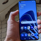
The HTC One Max is the largest member of the One family and has even been accused of being too big, despite that being the whole point. It sits towards the larger end of the phablet market with its 5.9 inch display and is a direct competitor with Samsung’s Galaxy Note 3.
We have to admit that even though this is intended to be a two-hand handset, it was a bit bigger than we could comfortably handle.
Design

The One Max still sports the handsome aluminium design of the One and One Mini. Unfortunately, this beautiful design hasn’t transferred well to the bigger screen.
The problem is that aluminium doesn’t make for a sure grip. This doesn’t matter with a smaller device, but when you stretch it out to a phablet-size it makes the One Max difficult to hold and use. It feels like it could fall out of your hand at any time.
The BoomSound speakers that were such a good addition on previous models are also a double-edged sword. They still provide an unparalleled smart-device listening experience, but they add to the already huge dimensions. We’re happy that they still made an appearance, but it’s another example of how you can’t just make handset bigger and expect universal improvements.

To give the One Max a unique selling point, HTC has included a rear-facing fingerprint scanner, not unlike the Home button on the new iPhone 5s. It’s a handy feature, but it can be tricky to reach. Once again we can see this feature being much more comfortable on a more standard-sized phone, but on the Max it does nothing to reassure the already dubious grip.
On the upside the Max does rock a removable rear plate. This means that folks can carry around a spare battery if need be. More importantly, once you take off the back you now have access to a MicroSD slot for expandable storage.
The Lock button has been moved to the right side under the volume rocker making it easy to reach. The IR blaster and 3.5mm headphone jack are still up top.
How big is too big?

It’s difficult to peg the size of a phablet as a problem. They’re designed for the consumer who wants a big, two-handed device and who is thus aware of the drawbacks. That being said, there is a tipping point beyond which a phone stops feeling ‘big’ and starts being cumbersome. The One Max is just over the wrong side of this line.
Despite the display only measuring 0.2 inches bigger than the Note 3, the overall device feels much, much larger. It barely fits in most pockets. If it does, it creates a noticeable, even comical outline. Worse than that, simple things like sitting down or walking up stairs become a bit of a chore.

Handset size is a totally subjective area and opinions differ wildly. For us, what should have been a relatively minor difference between the Note 3 and One Max became a noticeable and uncomfortable issue.
Display and user experience

Being a straight upsizing of the original One, the One Max rocks a fantastic display. Even with such a large screen, the 1080 x 1920 pixel resolution means you get 376 pixels per inch (ppi). For comparison, the iPhone’s Retina Display has just 326 ppi.
As for hardware, the One Max has received a bit of guff from critics for having the same specs as the original One, and not the next generation of processing power. With 2GB of RAM and a Snapdragon 600 processor, on paper it’s less impressive than the Note 3 – its prime competitor.
In the real world, the One Max works fantastically. Despite its lesser hardware, it came off feeling as quick, if not a bit quicker than the more-powerful Note 3. This is probably thanks in part to Samsung’s penchant for bogging down its UI with questionable ‘features’, and in part because HTC has had time to familiarize itself with this particular set of hardware, allowing for increased efficiency.

The Sense 5.5 UI is a solid upgrade from the One’s 5.0. It doesn’t add a whole lot, but there are some notable improvements, especially in BlinkFeed.
Firstly, you can now turn BlinkFeed off if you want to, but we think it really benefits from the bigger screen. You can also add RSS feeds to BlinkFeed now, instead of just the pre-decided publications that it originally relied on. It makes it much more useful than it was before.
The last BlinkFeed upgrade is the added side-menu. It’s an easy way to go between your topics and increases the range of sources you can add without making it too cluttered to use.
One particularly strange issue that's been introduced is with 3rd party keyboards. For some reason, switching to Airplane Mode and back causes your default keyboard to revert to the HTC native one. This is even more annoying because the settings menu doesn't have a simple option to switch the default back to your preferred one. You have to uninstall the app and re-install in order to get it back. Unfortunately, doing this deletes all of the saved data, so programs like Swype that learn your typing habits have to start all over again.
Camera

The camera on the One Max is the same 4 UltraPixel shooter found on the HTC One. It takes great shots during the day and has the same fantastic low-light quality.
Even though it’s already pretty good, would like to have seen some improvement in the low-light department. In six months we’d have hoped for at least a minor camera upgrade.
In fact, the One Max’s camera sports one less feature than its predecessor. HTC has removed the Optical Image Stabilization (OIS) component. OIS can be really handy in situations where it’s difficult to hold the camera still.
Unfortunately the HTC One’s problems with light-bleeding are still hanging around. Whenever you have a portion of a photo that’s significantly brighter than the rest you get some pretty obvious glare lines. This doesn’t happen much on nice sunny days, but anything from over-cast and darker is bound to suffer a bit.

All the funky Zoe stuff is still there. It may have turned out that most folk don’t bother with it, but a short 3 second clip makes for an awesome and unique-looking vacation album and we love it. It’s one of the few clear advantages that the One Max sports over the competition.
Video capture is pretty good; about equivalent with other high end devices. It maxes out at 1080p, so it doesn’t capture 4k like the Note 3 does. We can’t stress enough that this doesn’t actually matter. The ‘4k’ capture from the Note 3’s camera doesn’t differ noticeably in quality from its 1080p setting, so there’s no point in holding the lack of 4k against the One Max.
Battery Life
Battery life from the large 3300mAh battery is fantastic. We don’t know how HTC did it, but you can use a One Max pretty heavily for a full day and have around 30% charge left when you plug it in at night. This is with the screen set to full brightness and connected either a 4G LTE or WiFi network the whole time.
Even on days where we went snap-happy it was still going strong while we were getting ready for bed.
Lots in the box
The One Max comes with a complimentary clear protective case and a set of surprisingly good earbuds.
The case is a pretty standard plastic affair. It’s hardly stylish or super-durable, but it’s good enough for a freebie. It should protect the One Max pretty well and, seeing as it’s clear, doesn’t detract too much from the attractive design. Unfortunately it does little to improve on the grip situation, so if like us you feel like you’re on the verge of dropping the Max then you might want to grab something a bit more rubbery.
HTC seems to have learned something from its short-lived partnership with Beats Audio. The earbuds are a straight-up knock off of Beats design, which is fine by us because that means they’re stylish and comfortable. They also offer way better sound than any other generic earbuds we’ve used from a smartphone OEM.
A great phablet, but nothing new

For all intents and purposes the One Max is pretty much a giant version of the HTC One. It’s fast, reliable and offers an intuitive and aesthetically pleasing experience.
That being said, the HTC One came out 6 months ago now. That means that in 6 months HTC hasn’t really changed its user experience except for a few Sense 5.5 introductions and increasing the size of the screen.
Maybe if the One Max was a bit cheaper we’d be more excited. It really should be considering that its components have been around for a while now.

All up, the One Max is one of the best phablets. Unfortunately it’s a bit too big to use comfortably and doesn’t offer a clear reason to pick it over the competition.
Ultimately we’d suggest the Note 3. The lighter and more compact build makes all the difference, plus you get the added feature of the excellent S-Pen.
Related Articles
Find Better Phones and Plans
Hundreds of cell phone plans unpacked. All the facts. No surprises.


