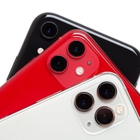
Taking over from last year’s One M8 is a lot for the new One M9 to live up to. It was one of the best phones of 2014 and was, by far, the most gorgeous mobile device to hit any market, anywhere.
Unfortunately, the M8 also suffered from a couple of flaws. The camera was none-too impressive and failed to compare to the likes of the Galaxy S5 and the LG G3. It was also a very slippery device thanks to its too-smooth finish. This meant it was difficult to hold on to, which is not something you want from a beautiful, expensive piece of kit.
Does the M9 address these issues? Yes and no.
Design

The M9 is a clear win in terms of aesthetics. We’ve never been big on gold phones here in the office, but the Gold on Silver M9 we got our hands on has convinced us that it’s possible to pull off.
More of a halfway mark between copper and gold, the trim around the end of the device is a luxurious highlight that reminds you time and again that you’re using a top-tier smartphone. This is what a phone this expensive should do: make you feel special just by looking at it.

Once you pick it up the improvements continue. Where the M8 was hard to hold on to, grip here is firm. The less-rounded edges and reduced smoothness add just enough friction that accidental drops are far from your mind.
While it may sound like a strange thing to highlight, the buttons on the M9 are fantastic. Most prominently, the lock button has moved to the right side, which is a huge improvement over the top-mounted M8 placement. When you’re hitting a button dozens of times daily, you want there to be as little stretching as possible, especially when it means dangerous finger gymnastics that could result in a cracked screen.

It takes a little getting used to how low the lock button is, but that takes a week at most. If you get caught fumbling for it in the dark, HTC has given it a textured finish so that you can tell it apart from the two, separate volume controls located on the same side.
The BoomSound speakers have made their comeback, as has, unfortunately, that darn black HTC logo bar at the bottom. At this point we’re thinking this has to be some kind of unavoidable hardware requirement. HTC has copped flak for this years in a row, so keeping it purely for branding would be a poor decision.

Probably the only real drawback of the One M9’s physical design is the rear camera. The plastic, boxy look sticks out like a cheap pair of trackpants in a high-roller’s club. It’s an unnecessary eye-sore that seems like a last-minute rush-job, rather than what could be an elegant cherry on top of an otherwise flawless cake.
Screen and user interface

One of the things for which the M9 has come under fire is its 1080p (1920 x 1080) display resolution. In 2015 this is considered by many as a poor offering, but don’t get caught up in that pointless numbers game. Quad-HD (2560 x 1440) screens like those on the Galaxy S6 twins are certainly crisp, but it takes a keen eye to really spot the difference.
On the other hand, 1080p panels use significantly less battery power than their quad-HD cousins. The choice really comes down to: slight image improvement vs noticeably longer battery life. We know what we’d choose.

Colors come out vibrantly and blacks have a good, inky depth to them. Whites are not the purest we’ve seen, but nor do they suffer from the blue or yellow tinge that we’ve seen on many an AMOLED display.
Brightness is great, although the protective glass is a little on the reflective side. This pairing makes for a blinding force in dimly lit environments, but an at-best readily visible experience in direct daylight.
The Sense user interface (UI) gets better with each passing generation. HTC has done a great job cutting back on pointless features and minimising screen noise to create a relaxing, minimalist UI. It’s fast, smooth and almost as pretty as the phone on which it runs.

That being said, BlinkFeed will still plague your home screen lineup by default, but you can always remove it by zooming out, performing a tap & hold and then sliding it to the trash icon.
User experience and battery life

Apart from the general smoothness of the UI and the overall good screen, there are other usage factors that must be considered.
A common theme in M9 reviews and first impressions has been that of overheating. We found that the M9 does tend to get a little warmer than other devices, but not so much that it becomes uncomfortable. It doesn’t seem like a CPU or design flaw, more it feels like a result of the aluminum from which the casing is made.
Aluminum is a good transmitter of heat. As such the case is more prone to mimic the internal temperature of the device, as well as pass that same heat on to your hand. It’s not the best situation for HTC, but we wouldn’t trade the M9’s physical design for the sake of a few degrees.

App stability is great. We never once had a single app crash, nor become laggy or fall prone to bugs.
Battery life is satisfactory, but un-amazing. Frankly we would have expected more, given that HTC opted to snub quad-HD in favor of 1080p. The M9 delivers a full day of medium-to-heavy usage, but no more. Don’t expect to make it to lunch time on day 2 of a single charge.

Finally, the One M9 has one little quirk that will get annoying if you commonly use any Bluetooth device, like a headset or earbuds. Pairing a connected to the M9 is normal enough and happens quickly. That's good, because you have to redo it every time you power your Bluetooth device down and turn it back on again.
If your earbuds, like mine, happen to have NFC then that's not too great a chore, although it is still annoying. If they don't you'll be rooting through the Bluetooth settings menu once or twice a day.
Camera
Here lies the rub. HTC finally stopped trying to convince the world that 4MP cameras are a good idea and went the other direction to the point of madness with its new 20.7MP shooter. This is the same sensor as found in the Xperia Z3 line of phones, so you would expect the camera to be as good, right?
It’s not. It’s barely an improvement over the M8. Shots suffer from light-bleeding, milkiness, drab colors and an inability to handle any frame with multiple light intensities. Check out this next photo, taken at around 4pm on a sunny day, for which we committed no crime other than to be sitting in the shade of a tree.

As for low-light photography, forget it. Anything taken indoors, either during the day or post-evening, looks like something from two or three years ago. There’s a lot of noise, inaccurate coloration and an inability to deal with artificial lighting.
This is the biggest let-down of the M9, and may prove to be its downfall.
The front-facing camera is refreshingly good, probably because this is the same camera that HTC tried to pass of as the main rear shooter on last year’s M8. Here's a pice from that same baseball day above, taken from roughly the same position but at a reverse angle.
Thanks to its Ultrapixel design, it handles more lighting situations than most front-facing cameras. It’s comparably crisp and bright to even an iPhone’s selfie cam, which is good news if you’re in to that kind of thing.
Verdict

The HTC One M9 is an odd device. On paper it’s barely an upgrade over the M8. In press photos it’s physically almost identical, it has the same screen and resolution, even the new camera offers the same lacklustre experience.
All this being said, there’s something about the M9 that keeps you coming back. This is a solid, well-built smartphone that gets the job done with minimal fuss.
It has design engineering coming out of every port and reflected from every surface. This is a phone that feels like you could continue to love it well after your carrier contract is done.
Unfortunately, that’s not going to be enough. With the Galaxy S6 around the corner, the M9 is probably destined to perform poorly. We can’t say we blame anyone. The S6 is a sure bet to rock one of the best cameras on the market and has a new sexy design to back it up. Plus it’s cheaper in most markets.
If camera quality is not something you care about, give the M9 some serious consideration. It’s the first ‘premium’ phone that really lives up to that title, at least in look and feel. However, if you’re an even occasional photo-snapper, you might want to wait around and see how the GS6 handles in comparison.
Related Articles
Find Better Phones and Plans
Hundreds of cell phone plans unpacked. All the facts. No surprises.


